Editor's review
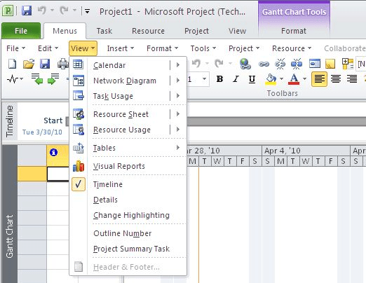
This software replaces the ribbon interface of Microsoft project with the older/ classic version of the menu and toolbars.
With the introduction of the 2010 version of the Project, MS has introduced the new ribbon interface. Most users of Project are really comfortable with the menus and toolbars of the 2003 and 2007 versions. The ribbon interface introduces an entirely new style of the menu/ toolbar. For users used to these older versions, the new style introduces couple of challenges. The first challenge is to be able to find the features one was using from this new set up. The arrangement being entirely different, this could pose quite a problem and take substantial time for the user to become completely familiar. The second challenge is to discover the new features. They could get lost due to unfamiliarity of the new scheme. Presenting the user with something familiar is a good strategy to overcome both these problems.
The user then can continue to use the product without losing much productivity and can pace his learning of the new interface. It could, in fact, become easier to learn “by comparison”. The user may also simply ignore the new fangled stuff and continue with the older style menu. New users do not face the challenges; he has the task of getting familiar with the new set up directly. Thus, though the step may look retrogressive it can mean a lot savings in time and hassles for heavy users. The alternative is a drop in productivity while users learn the interface and not many on-going projects can take the strain. This is a very handy tool and integrates well with the paradigm users are addicted to.


User comments